

The Spyder Trap team is excited to debut our new mobile website. We’ve been diving into a lot of mobile web design and mobile app projects for our clients, but it was time to give our own mobile visitors a better experience on their iPhone, Android or Blackberry device.
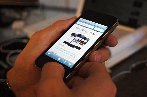
Simplicity & Mobile Go Hand In Hand
With the mobile site we wanted to provide the user with a simple and clean experience that highlighted everything Spyder Trap offers. The site provides a breakdown of services, insight into our culture, a taste of our portfolio, access to the blog and a fast and easy way to contact us.
In our planning for the design and development of the site we looked at:
- Intuitive mobile navigation (touch, not clicks)
- One touch access to main content
- Custom mobile blog version (not a WordPress template)
- Google maps, click to call
- Mobile browser detection, link provided to full site
Mobile Portfolio
In an effort to reduce the need to hit the back button after viewing each project, we decided to use a collapsible slider navigation to allow the user to stay on one page and view all of our projects easily.
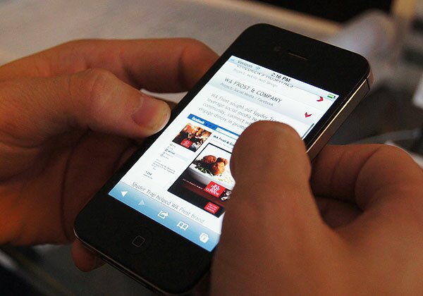
We felt this portfolio slider feature met our intuitive navigation and simplicity goals nicely.
Currently over 5% of visitors to www.SpyderTrap.com are using mobile devices, but that number will only increase over time. Some of our clients see 25% of their website traffic coming from mobile devices.
It’s safe to say a mobile website is a good idea for any business or organization and may soon become a must (if you’re a restaurant, it’s already a must).
We would love to hear your thoughts and opinions on our new mobile website. Pick up your smartphone, visit our site, leave us a comment below or tweet us at @Spyder_Trap.
Updated: Our mobile site was featured on MobileAwesomeness.com on 9/5/11.